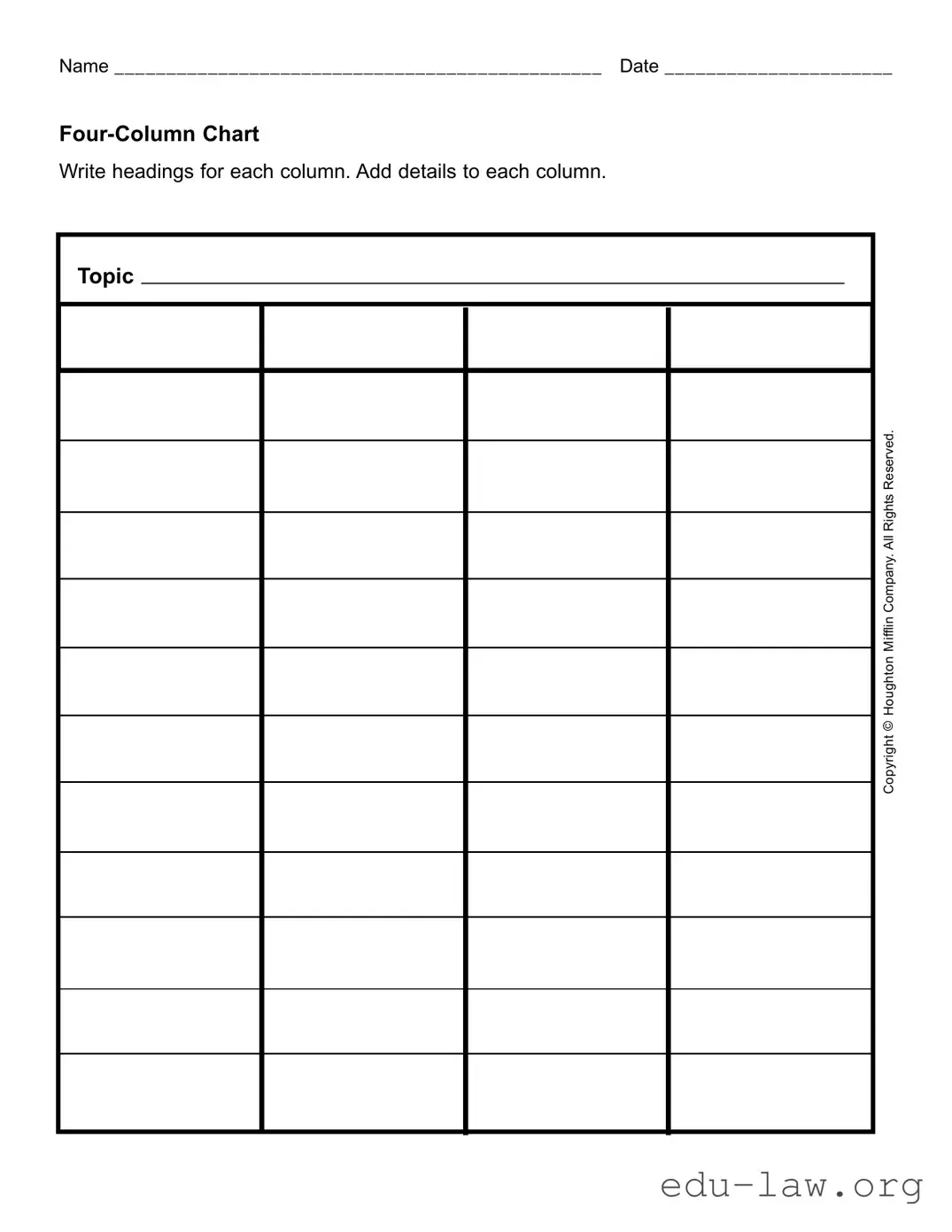
What is a Four Column Chart?
A Four Column Chart is a structured tool used to organize information. It consists of four columns that allow individuals to categorize and compare details within a framework. This format is beneficial for both educational and organizational purposes, enabling clear visual representation of data.
How do I use the Four Column Chart form?
To use the Four Column Chart form, start by writing a topic in the designated area. Next, define and label headings for each column, which will guide the categorization of your information. Once the headings are set, fill in the respective columns with details relevant to the topic. This structured approach helps in organizing complex information efficiently.
What types of topics can be used with the Four Column Chart?
The Four Column Chart can be applied to a wide range of topics, including historical events, scientific concepts, project planning, and even comparative analyses of various subjects. The versatility of the chart makes it a valuable tool for students, professionals, and researchers.
What guidelines should I follow when creating headings for the columns?
When creating headings, choose terms that are clear and descriptive. Each heading should relate directly to the information you plan to include in that column. It's essential to ensure that the headings facilitate easy understanding and interpretation of the content arranged below them.
Can the Four Column Chart help in decision-making?
Yes, the Four Column Chart can enhance decision-making processes. By organizing pros, cons, facts, and observations in a clear layout, individuals can assess options more effectively. This visual comparison aids in identifying patterns and trends that may not be immediately apparent in text-heavy formats.
Is there a specific format or size for the Four Column Chart form?
No standardized size exists for the Four Column Chart, as it can be adapted to fit various needs. Users can choose to create their own format, whether on paper or digitally, depending on the amount of information being organized. Consistency in column width is essential for clear readability.
How should I summarize the information after filling out the Four Column Chart?
After completing the chart, summarize the key insights from each column. Focus on the overarching themes and any notable comparisons. This summary can be in bullet point form or a short narrative that captures the essence of the data presented in the chart.
Where can I find resources to help me create a Four Column Chart?
Various online templates and resources are available to guide the creation of Four Column Charts. Educational websites and tools, such as Microsoft Office and Google Docs, offer templates that can be customized. Books on data organization and visual learning may also provide valuable tips and examples.
Can the Four Column Chart be used collaboratively?
Absolutely. The Four Column Chart can serve as a collaborative tool. Teams can work together to fill in the chart, fostering discussion and idea sharing. Digital platforms allow for real-time collaboration, making it easy to gather input from multiple contributors regardless of their location.

